Work

Willow Flowers
Flowers
Willow
Willow Flowers
Expanding Willow Flowers beyond a logo into a story-led identity that turns floral gifting into memorable emotional expressions by SERB.
Willow’s identity extends far beyond a logo, it was built as an emotional brand experience celebrating boutique floristry and meaningful human connection. Designed as more than just a flower shop, Willow is a lifestyle platform for life’s most celebrated moments. Grounded in brand strategy and market research, the visual identity takes cues from organic botanical movement reinterpreting natural stems, petals, and artisan bouquets into a clean, responsive design system. This gives the brand digital-first flexibility and a scalable foundation for long-term growth across both e-commerce and retail platforms. This unified brand language extends seamlessly across all touchpoints: the refined logo, cohesive color palette, luxury packaging, photography, storefront design, and apparel. By connecting online flower delivery with an elevated in-store experience, every touchpoint tells a single, memorable visual story.
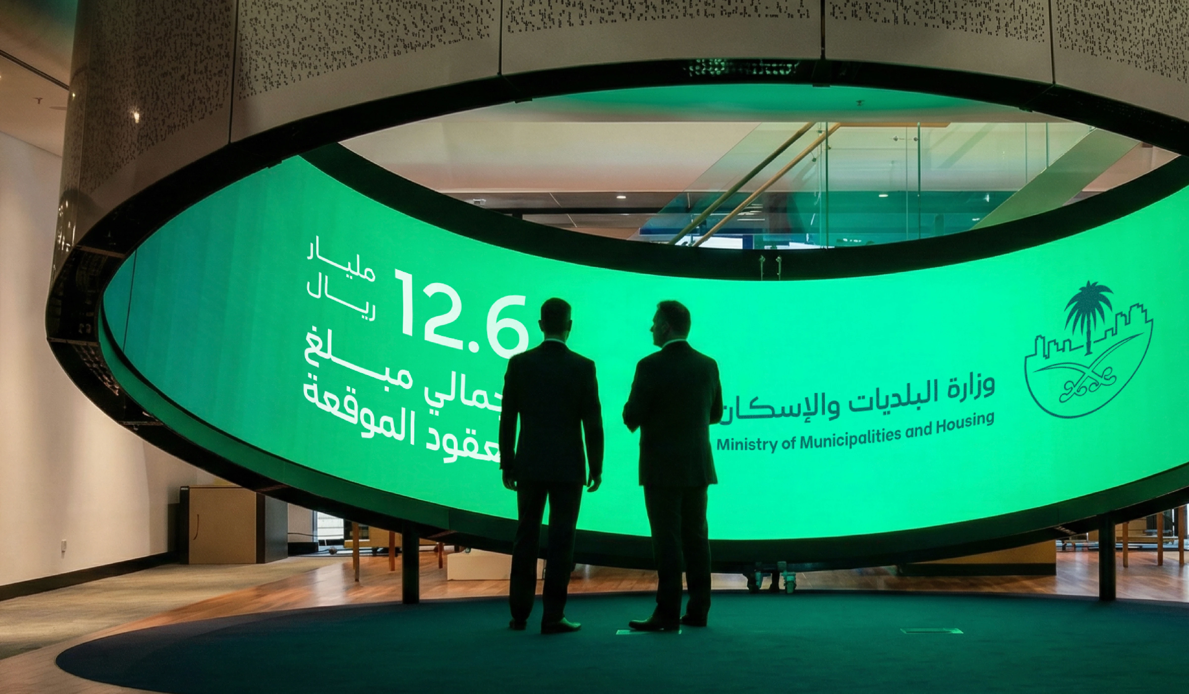
Ministry of Municipalities and Housing
Government
MoMaH
MoMaH Rebranding
Enhancing a government logo to reflect clarity, modernity, and national impact by SERB.
For Ministry of Municipalities and Housing, we delivered a logo redesign and brand refresh that strengthens visual identity, improves recognition, and aligns with Saudi Arabia’s digital transformation and urban development vision. At the core of this work was a focused design strategy to refine the existing mark while preserving its equity, optimizing it for scalability, consistency, and performance across digital platforms and physical applications. The result is a modernized government logo with improved balance, legibility, and adaptability, designed to support brand consistency, enhance user recognition, and communicate institutional strength across all touchpoints.
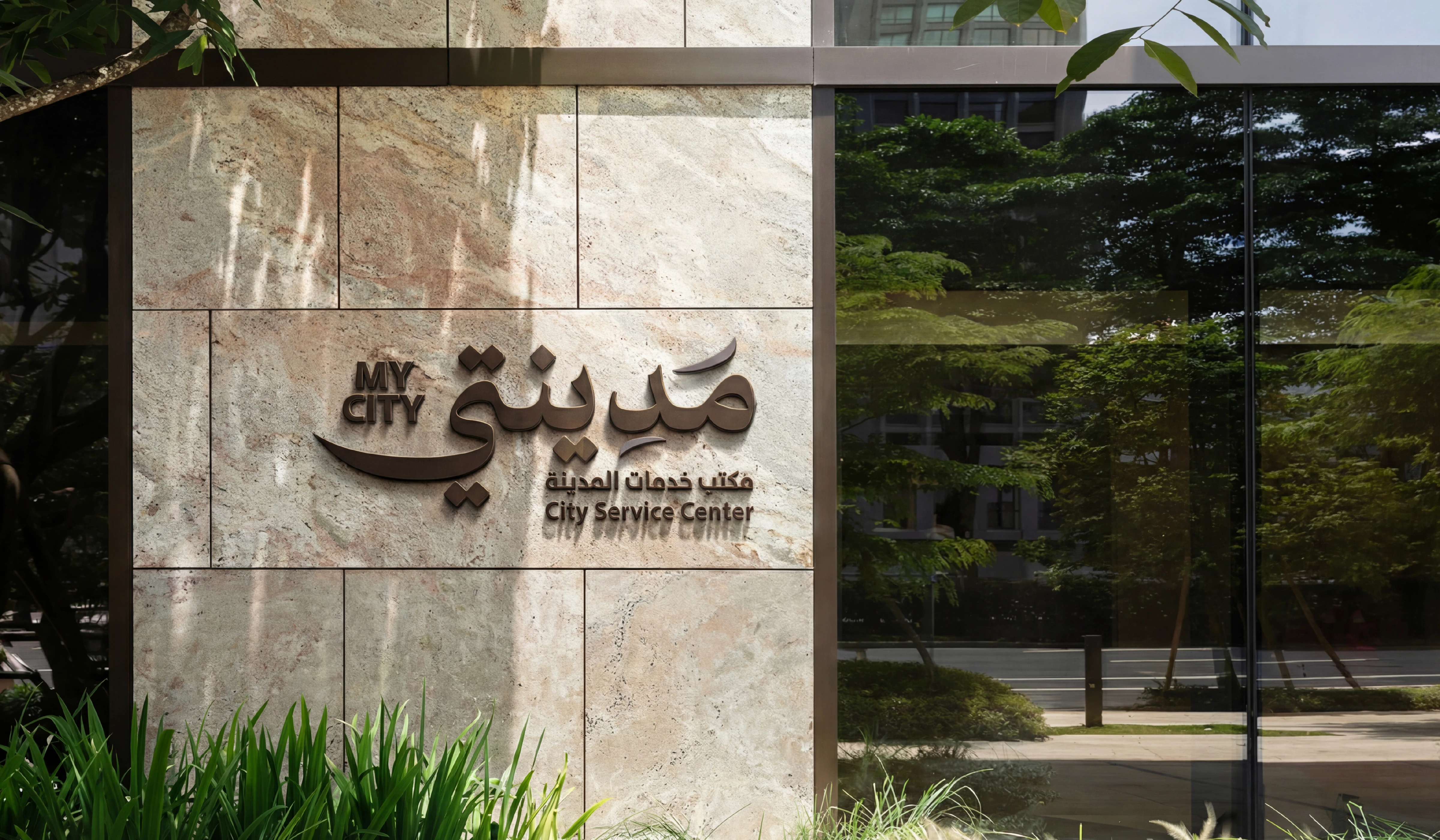
My City
Government
Riyadh Region Municipality
My City
A distinctive logo designed to express clarity, identity, and civic connection by SERB.
For Riyadh Region Municipality, we designed the logo for the My City application, creating a visual mark that reflects accessibility, trust, and the evolving relationship between the city and its residents. This work was driven by a clear intention to craft a symbol that is both intuitive and meaningful, translating the essence of urban services into a recognizable and scalable identity. The result is a refined visual mark that balances simplicity with symbolism, designed to function seamlessly across digital platforms while maintaining a strong and approachable presence.
ELM Brand Identity
Tech
ELM
ELM Brand Identity
Developing a Future-Ready Brand Visual System Rooted in Technology, Innovation, and Digital Transformation
ELM is a leading Saudi digital solutions company driving the Kingdom’s digital transformation. Our role in this project was to create a comprehensive brand visual system that translates ELM’s technological leadership into a cohesive and future ready identity. The goal was to craft a visual language that reflects innovation, connectivity, and digital intelligence while maintaining a strong institutional presence aligned with national ambitions.
We developed a modular design system inspired by data flow, interconnected platforms, and integrated digital ecosystems which represent the core of ELM’s technological infrastructure. The color palette was strategically defined to reinforce this direction. Deep purple communicates leadership and transformation, vibrant orange signals innovation and forward momentum, and blue tones convey trust, stability, and technological depth. The resulting identity is scalable, flexible, and built to perform seamlessly across digital platforms, corporate materials, and large scale brand environments.
Al Wadi Poultry Rebranding
Poultry
Al Wadi
Al Wadi Poultry Rebranding
This project began by redefining its essence and setting a new direction toward a minimal, bold, and contemporary identity.
Al Wadi was a brand with potential, yet without a clear visual voice. Its identity lacked recognition, consistency, and memorability, making it difficult to stand out in an increasingly competitive and design-driven market. The challenge was to transform Al Wadi from a visually quiet and undefined brand into a strong, minimal, and modern identity that feels bold, confident, and instantly recognizable. We aimed to strip away visual noise, refine its essence, and rebuild the brand with a contemporary language that balances simplicity with impact-creating an identity that speaks clearly, stands proudly, and positions Al Wadi as a powerful, future-ready brand.
We aimed to strip away visual noise, refine its essence, and rebuild the brand with a contemporary language that balances simplicity with impact-creating an identity that speaks clearly, stands proudly, and positions Al Wadi as a powerful, future-ready brand.
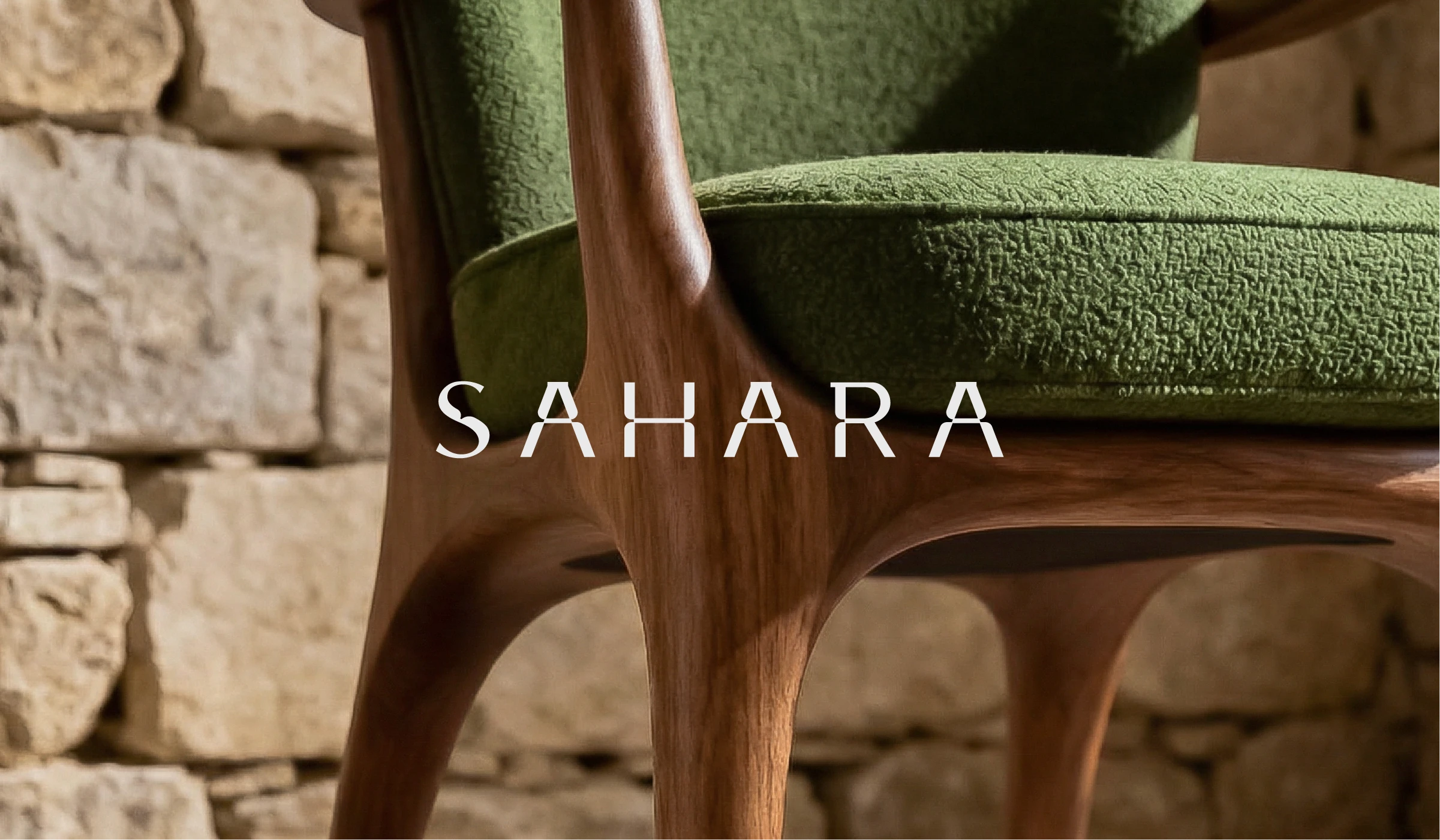
SAHARA
Furniture & Decor
SAHARA
SAHARA Mall Rebranding
Building a Distinct Real Estate Brand Rooted in Prestige and Urban Vision
Al Mayassa Real Estate is positioned as a forward thinking developer shaping upscale business and mixed use destinations in Saudi Arabia. Our role in this project was to create a comprehensive brand identity that communicates confidence, credibility, and architectural ambition while establishing a strong and memorable market presence. The visual identity was built around a refined monogram that symbolizes structure, balance, and elevation, reflecting the company’s commitment to premium development. A deep purple was selected as the core brand color to express prestige, authority, and long term vision, while subtle gradients and clean layouts reinforce modernity and clarity. Elegant typography enhances the sense of sophistication and positions the brand within the high end real estate sector. The system was designed to perform consistently across construction hoardings, outdoor campaigns, digital platforms, and corporate materials. From large scale site branding to marketing collateral, every touchpoint communicates Al Mayassa’s promise of creating upscale business communities and landmark destinations defined by quality and distinction.
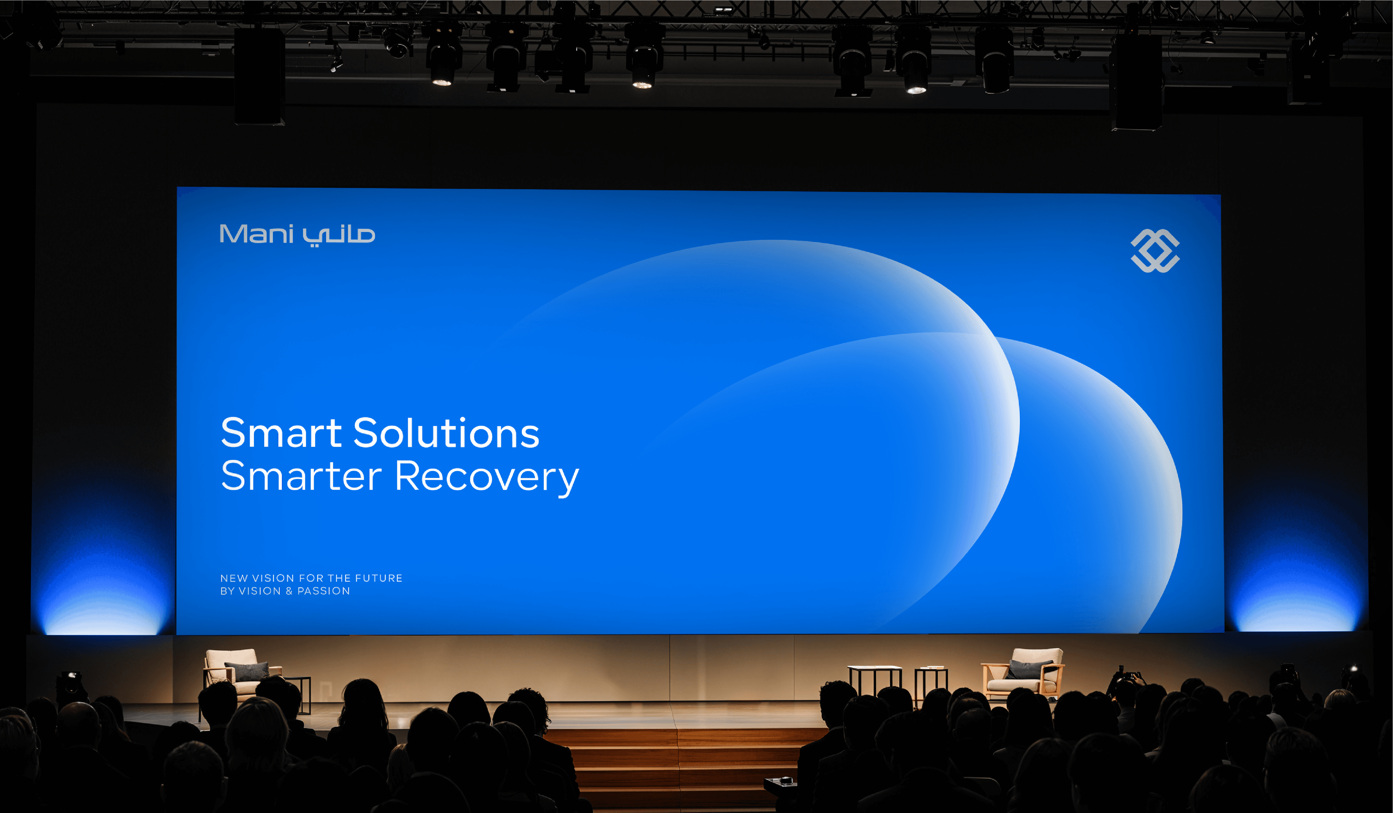
Mani
Cooperate
Mani Company
Mani Company
A visual identity designed to convey trust, authority, and financial clarity by SERB.
For Mani Company, we created a visual identity that reflects the brand’s role in managing financial obligations with professionalism and transparency, translating complexity into a clear and approachable presence. At the core of this work was a focused intention to shape an identity that balances confidence with clarity, allowing the brand to communicate reliability while remaining accessible across every touchpoint. The outcome is a refined visual system built around a distinctive and recognizable mark, designed to convey credibility and perform consistently across digital and physical environments.
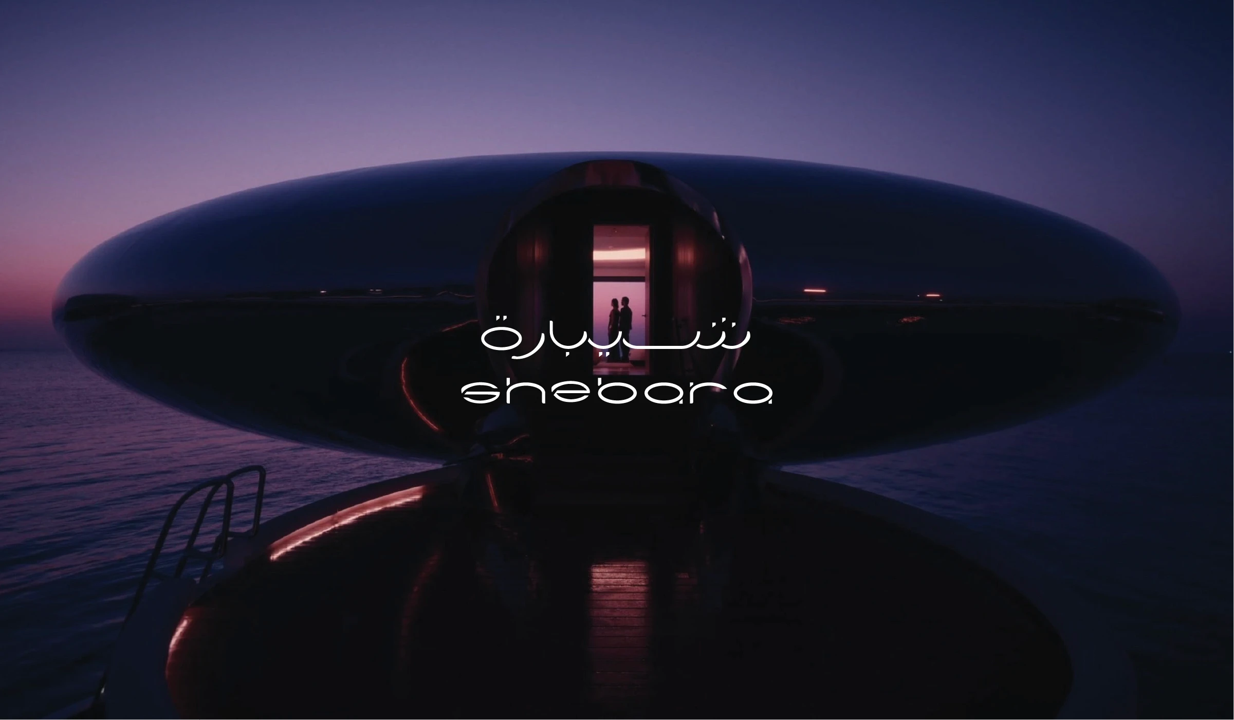
Shebara
Hospitality
Red Sea
Shebara Logo Design
Building a Distinct Real Estate Brand Rooted in Prestige and Urban Vision
Al Mayassa Real Estate is positioned as a forward thinking developer shaping upscale business and mixed use destinations in Saudi Arabia. Our role in this project was to create a comprehensive brand identity that communicates confidence, credibility, and architectural ambition while establishing a strong and memorable market presence. The visual identity was built around a refined monogram that symbolizes structure, balance, and elevation, reflecting the company’s commitment to premium development. A deep purple was selected as the core brand color to express prestige, authority, and long term vision, while subtle gradients and clean layouts reinforce modernity and clarity. Elegant typography enhances the sense of sophistication and positions the brand within the high end real estate sector. The system was designed to perform consistently across construction hoardings, outdoor campaigns, digital platforms, and corporate materials. From large scale site branding to marketing collateral, every touchpoint communicates Al Mayassa’s promise of creating upscale business communities and landmark destinations defined by quality and distinction.

Al Mayassa Branding
Real Estate
Al Mayassa
Al Mayasa Branding
Building a Distinct Real Estate Brand Rooted in Prestige and Urban Vision
Al Mayassa Real Estate is positioned as a forward thinking developer shaping upscale business and mixed use destinations in Saudi Arabia. Our role in this project was to create a comprehensive brand identity that communicates confidence, credibility, and architectural ambition while establishing a strong and memorable market presence. The visual identity was built around a refined monogram that symbolizes structure, balance, and elevation, reflecting the company’s commitment to premium development. A deep purple was selected as the core brand color to express prestige, authority, and long term vision, while subtle gradients and clean layouts reinforce modernity and clarity. Elegant typography enhances the sense of sophistication and positions the brand within the high end real estate sector.
The system was designed to perform consistently across construction hoardings, outdoor campaigns, digital platforms, and corporate materials. From large scale site branding to marketing collateral, every touchpoint communicates Al Mayassa’s promise of creating upscale business communities and landmark destinations defined by quality and distinction.
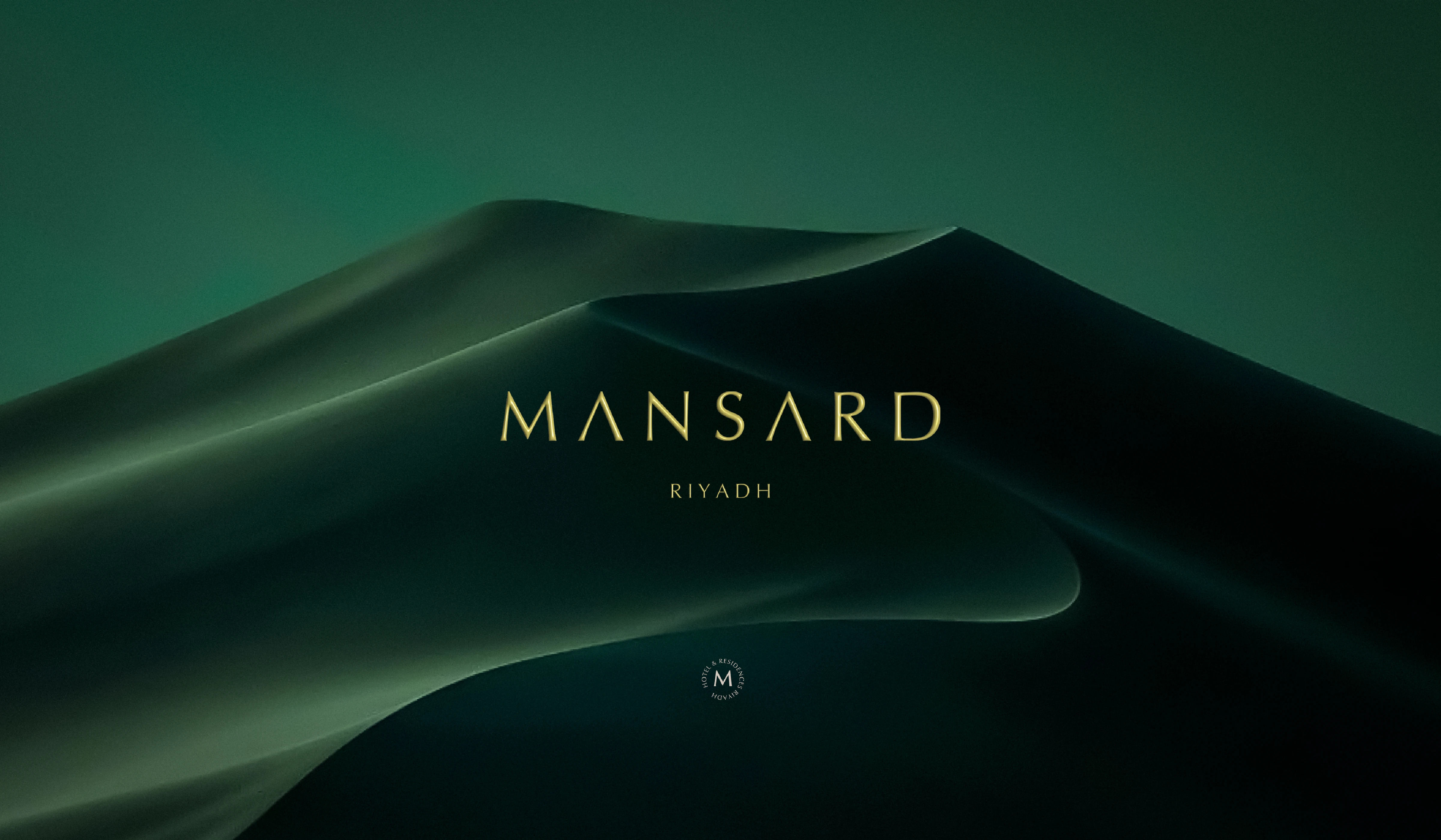
Mansard Hotel Brand Identity
Hospitality
Mansard
Mansard Hotel Brand Identity
Crafting a Refined Brand Identity Inspired by Timeless Luxury and Contemporary Hospitality
Mansard Riyadh is a luxury hotel and residential destination that blends European architectural elegance with modern Saudi sophistication. Our role in this project was to develop a complete brand identity that reflects the property’s premium positioning while capturing its timeless character and refined atmosphere. The objective was to create a visual system that communicates exclusivity, architectural beauty, and elevated hospitality. The identity draws inspiration from classical forms, symmetry, and the distinctive mansard roof silhouette, translating architectural heritage into a contemporary visual language. A rich deep green was selected as the primary brand color to evoke prestige, tranquility, and permanence, while metallic gold accents express luxury, craftsmanship, and attention to detail. Elegant typography with generous spacing reinforces a sense of refinement and confidence. The visual system extends seamlessly across stationery, digital applications, uniforms, and environmental signage, ensuring a cohesive and sophisticated brand experience throughout every guest touchpoint.