Rasaya
A new name for the next chapter
Rasaya is a real estate developer creating contemporary urban projects around smart planning, investment value, and architectural clarity. Formerly known as Rasanat Al Mimar Real Estate Development the company worked with SERB on a new name and visual identity aligned with its direction and long-term continuity. The new identity brings that same thinking to the brand, building a clear and consistent presence across every touchpoint.



Shaped by Urban Thinking
The visual system takes its cues from architecture and urban planning. Clear lines, geometric structure, considered spacing, and Arabic typography create a language that can move consistently from communication to the built environment.
A distinctive bilingual signature
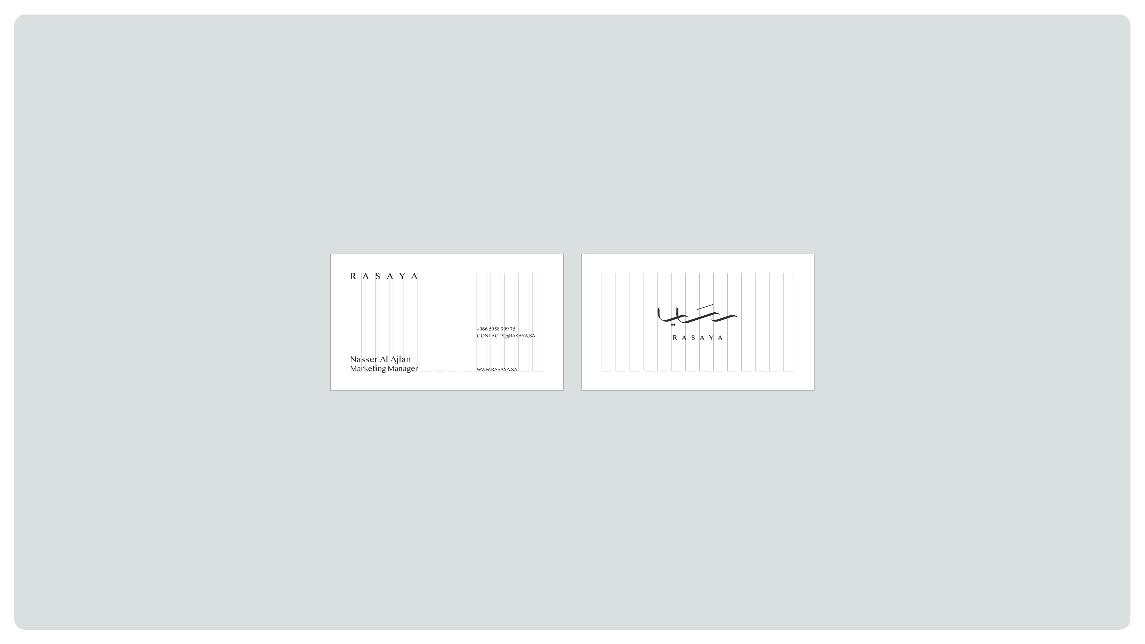
Arabic and English wordmarks give Rasaya a distinctive presence across both languages. Paired with a flowing symbol, the identity balances architectural structure with a sense of movement, creating a recognizable signature across scales and settings.
A considered visual language
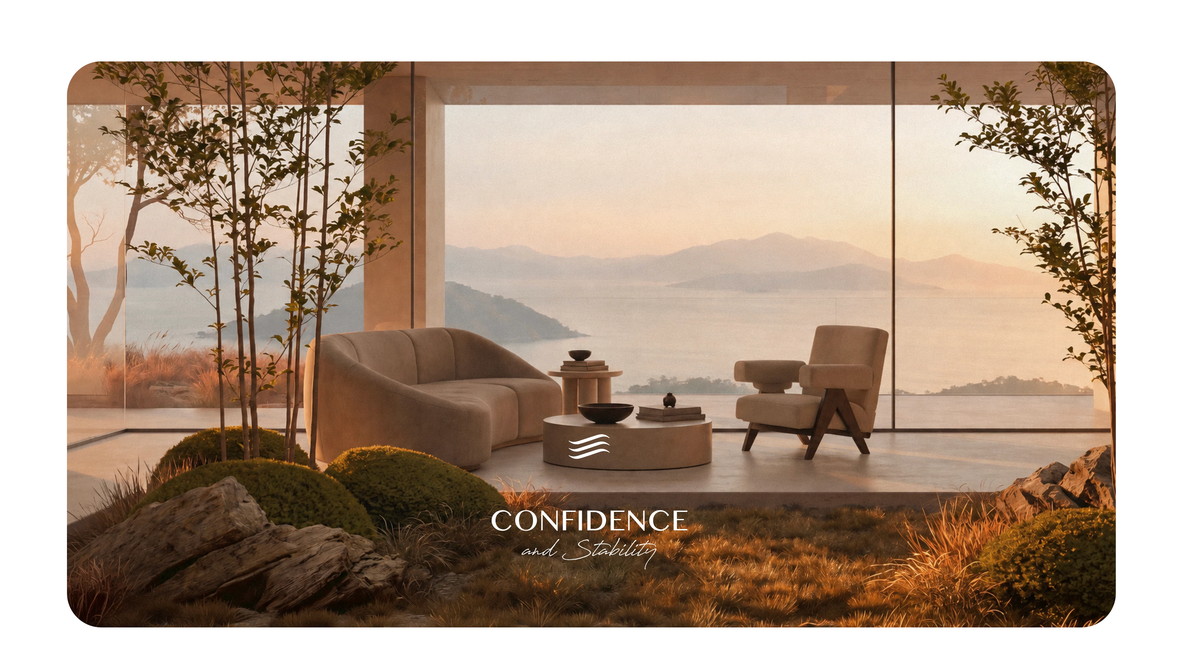
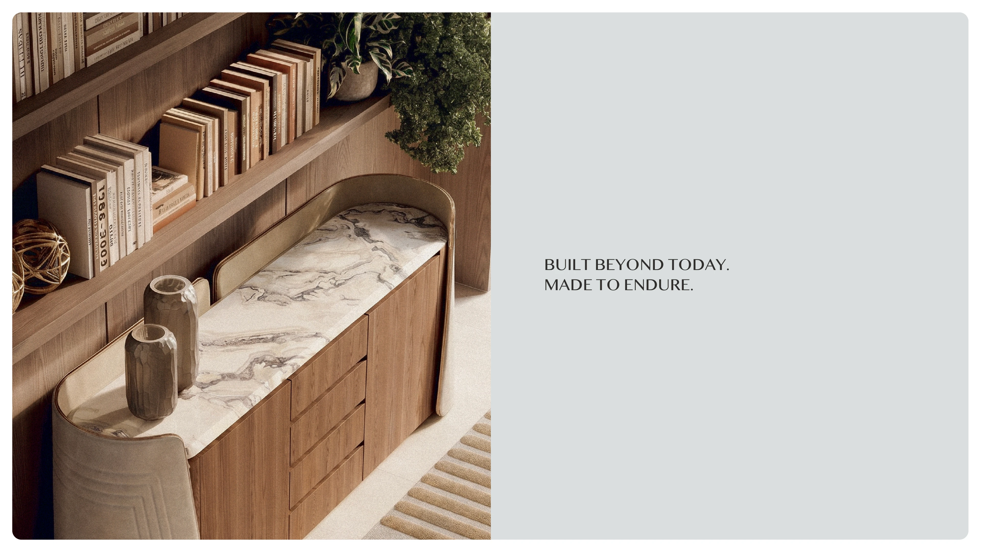
A restrained palette, deliberate typography, and generous spacing create a calm and confident identity. The system brings together architectural imagery and clear layouts to communicate Rasaya’s approach to contemporary development.
Consistency in every detail
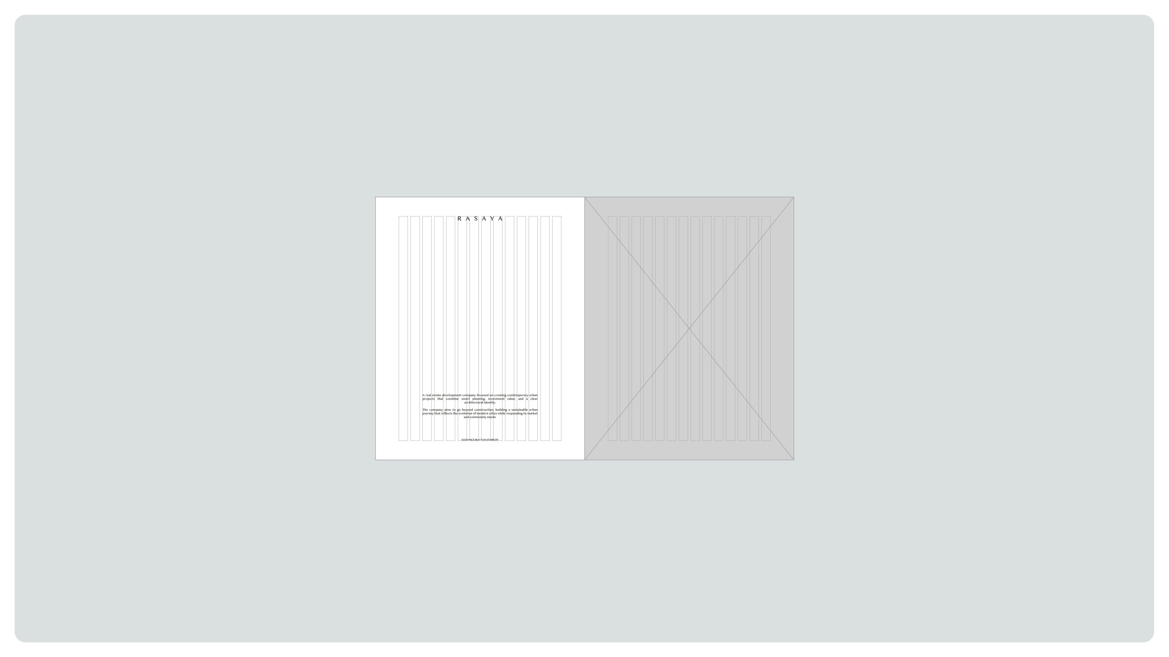
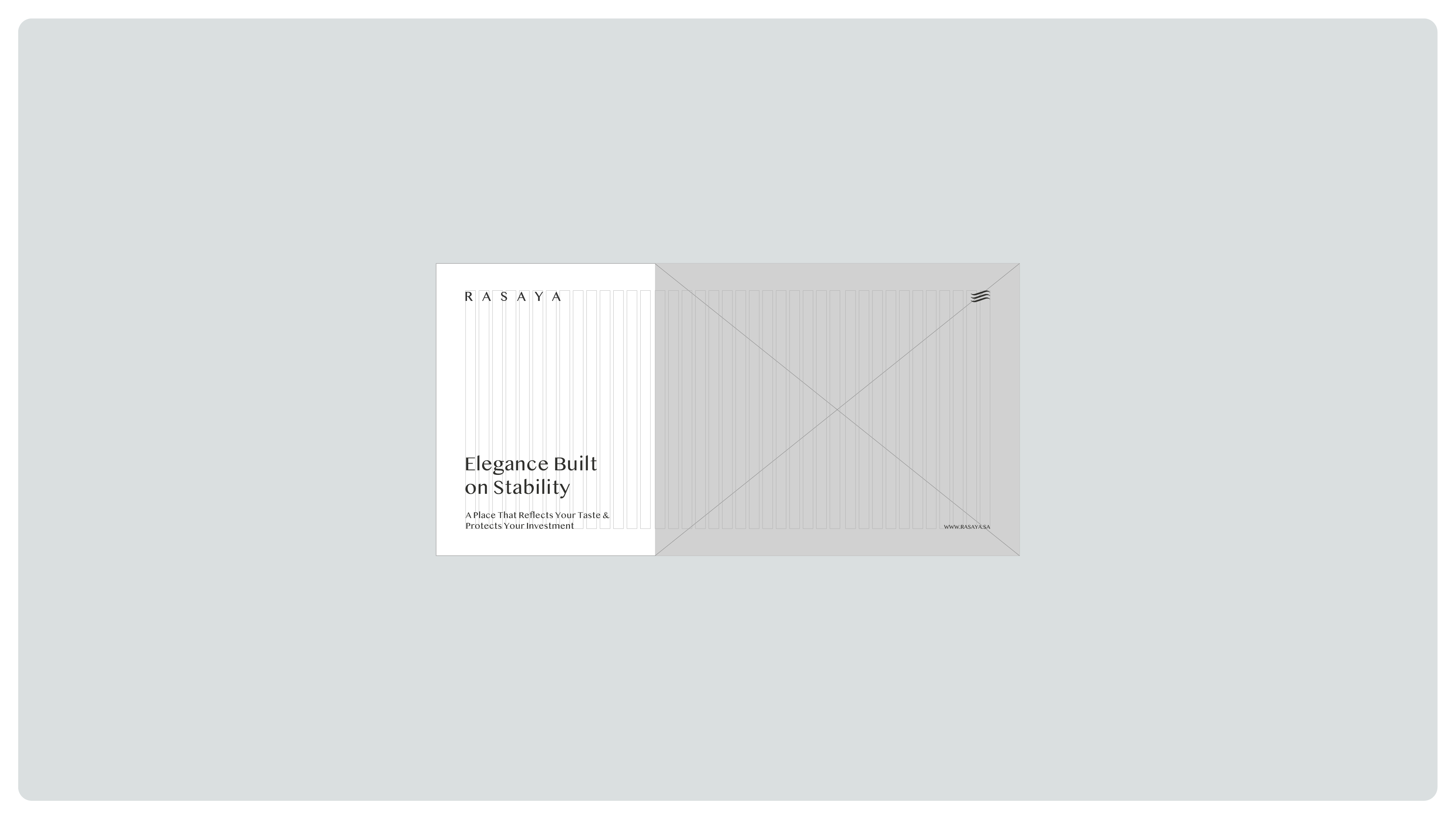
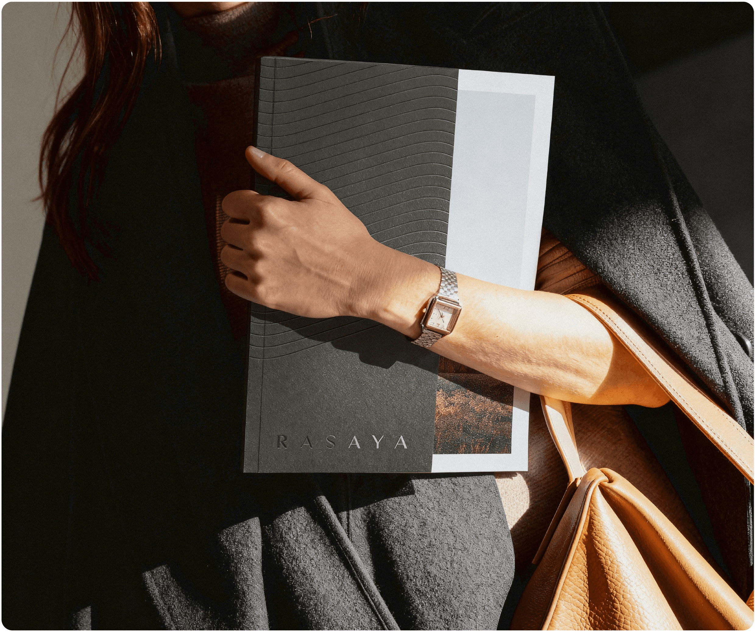
The identity extends across stationery, business cards, presentation materials, and branded objects. Each application uses the same visual principles, connecting everyday interactions to a coherent expression of Rasaya.
Built into the experience
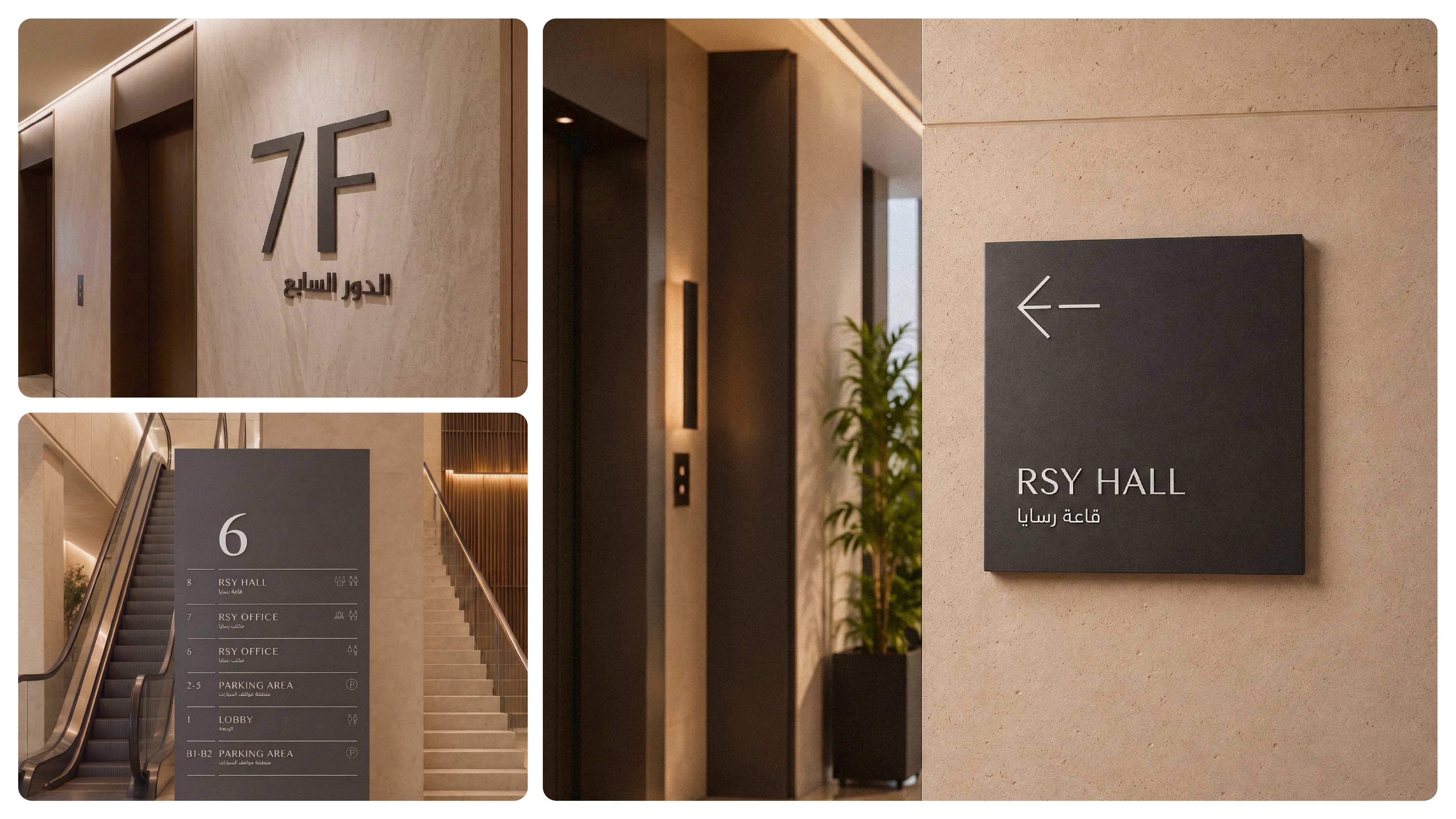
The system extends from identity and communication into signage and wayfinding, giving Rasaya a consistent presence throughout the environments it develops. Directional signs, floor identifiers, and pictograms carry the brand into the spaces people use.
A clear digital presence
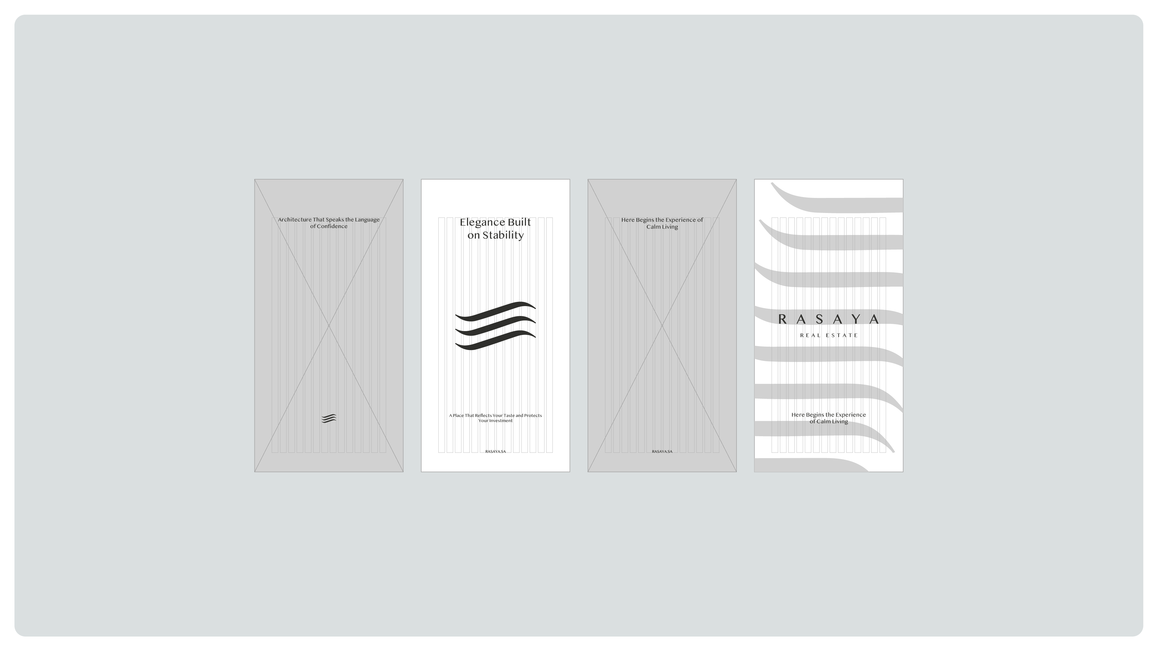
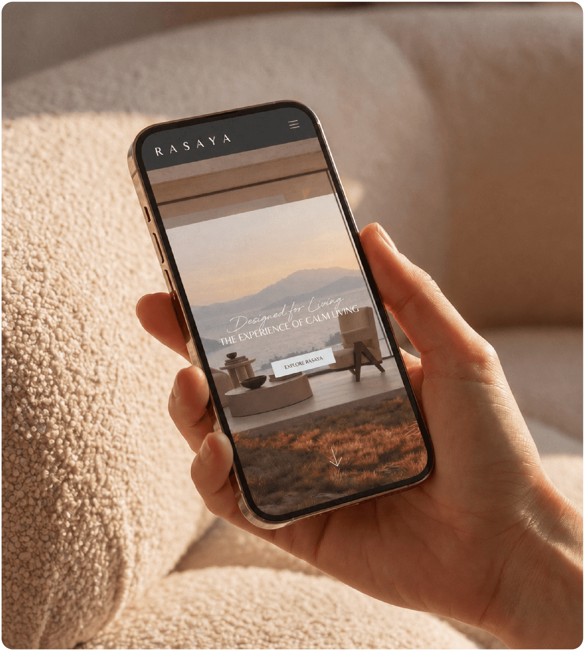
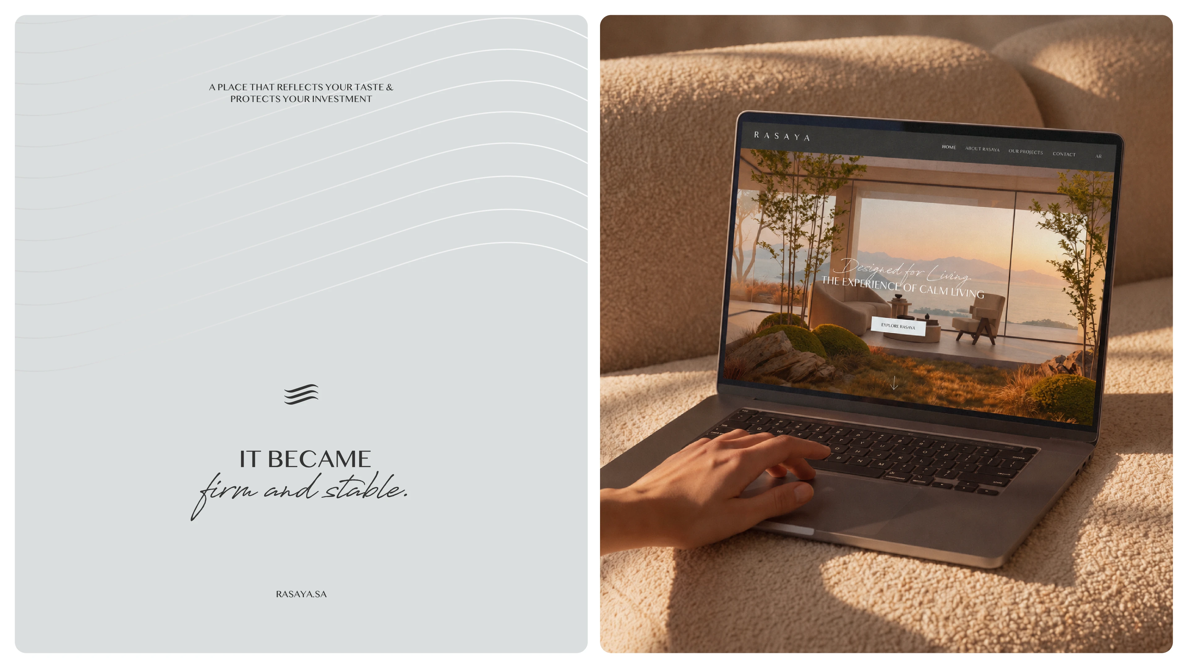
Digital applications translate the identity into mobile screens, social communications, and website layouts. Architectural imagery, a consistent palette, and clear typography help the brand communicate with clarity across platforms.




From the first introduction to the spaces it shapes, Rasaya presents a unified identity rooted in architectural clarity. The new name and visual system support a consistent brand experience as the company continues to develop.





Client
Rasaya
Role
Brand Naming, Brand Strategy, Visual Identity, Art Direction, Digital, Signage & Wayfinding
Year
To be confirmed
Credits
Project Information
Rasaya is a real estate developer creating contemporary urban projects around smart planning, investment value, and architectural clarity. Formerly known as Rasanat Al Mimar Real Estate Development the company worked with SERB on a new name and visual identity aligned with its direction and long-term continuity. The new identity brings that same thinking to the brand, building a clear and consistent presence across every touchpoint.